
Understanding the 60-30-10 Color Rule and When Interior Designers Actually Break It
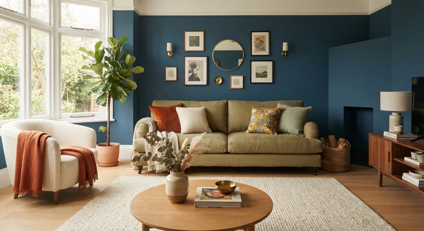
Photo credit: readerspanel.com
In this article
The 60-30-10 rule is a widely taught color formula. Learn what it means, why it works in many spaces, and when sticking to it rigidly limits creativity.
Key Takeaways
- The 60-30-10 rule divides a room's color into dominant, secondary, and accent proportions.
- It works because unequal ratios prevent any single color from overwhelming a space.
- The rule applies to any palette, including neutrals, bold tones, and pattern-heavy rooms.
- Designers break the rule intentionally for monochromatic, maximalist, or highly personal spaces.
- Treating it as a starting point rather than a fixed formula gives you more useful guidance.
How the proportions actually work
The 60-30-10 formula divides color into three roles with clear boundaries. The 60% tier is the dominant color: the one that covers walls, a large sectional, or a statement area rug. It sets the mood of the room. The 30% tier is the secondary color, visible in secondary furniture pieces, window treatments, or a large cabinet. The 10% tier is the accent, showing up in throw pillows, vases, artwork mats, or small decorative objects.
The ratios matter because unequal proportions are easier for the eye to read. When two colors share equal space, a room can feel divided rather than cohesive. The 60-30-10 split ensures that one color clearly leads, one supports it, and one creates contrast without competing. You do not need to measure anything literally: the percentages describe visual weight, not square footage.
Color in a room comes from every surface, not just paint. Flooring, upholstery, textiles, and even the finish on metal hardware all contribute to the overall proportion. A dark hardwood floor, for example, might absorb most of the 60% share before a single drop of paint is chosen. Starting with fixed elements and working from there is often more practical than starting with paint chips.
Start with what you cannot change
Before choosing paint or textiles, photograph the fixed elements in the room: flooring, cabinetry, a sofa you are keeping. Print those photos in color and note which tones are already present. This tells you which tier is already filled and which ones still need a choice. It is much easier to build from what exists than to start with a paint chip and work backward.
Why the formula holds up in most rooms
The rule's durability comes from how human perception handles contrast. A small amount of a bold or contrasting color reads as intentional. A large amount of the same color can feel overwhelming, especially in enclosed spaces with limited natural light. By capping the accent at 10%, the formula keeps visual tension at a level that feels purposeful rather than stressful.
Neutral-dominant rooms illustrate this particularly well. A room with warm white walls (the 60%), a linen sofa (the 30%), and terracotta accents in pillows and pottery (the 10%) feels resolved. Swap the proportions so terracotta covers the walls and the white becomes the accent, and the room reads very differently, often more intense than the same homeowner intended. The formula is not about which colors to pick; it is about how much of each to use.
Pattern-based rooms follow the same logic. When you use a patterned fabric, identify the colors it contains, then decide which of the three tiers each color belongs to. A floral print with cream, sage, and dusty rose might supply the 10% accent while the walls and floor provide the 60% and 30%.
60%
Dominant color's share of visual space
In the standard formula, the dominant color covers the largest surfaces and establishes the room's overall tone.
10%
Maximum share reserved for accent color
Keeping bold or contrasting color at this proportion is what allows it to read as intentional rather than overwhelming.
3
Color tiers in the standard formula
Most designers working with this guideline limit the active palette to three distinct hues before introducing neutrals.
When designers set the formula aside
Monochromatic rooms deliberately collapse the 60-30-10 structure. When a designer wants a space to feel enveloping or immersive, using a single color across walls, trim, and furniture in varying tones and textures achieves that. The variation comes from sheen and material rather than hue contrast. Applying the 10% accent rule here would interrupt the effect.
Maximalist interiors often operate on a completely different logic: multiple competing colors, high pattern density, and deliberate visual complexity. The goal is richness rather than balance, and the 60-30-10 split would impose a restraint that contradicts the intent. These spaces work through repetition and rhythm rather than proportion. Scale and proportion are still present, but the color rules shift.
Rooms defined by a single dominant material, such as a library paneled in dark walnut or a kitchen tiled floor-to-ceiling in handmade ceramic, also fall outside the formula. The material itself carries so much visual weight that trying to assign it a percentage tier can lead to awkward decisions. In these cases, a designer typically chooses a complementary background and lets the material lead unconditionally.
Personal style is a legitimate reason to deviate as well. A homeowner who genuinely loves intensity might prefer two strong colors sharing roughly equal weight. The formula is a teaching tool and a reliable default. It is not a rule with consequences for breaking it. If you want to see how assumptions about safe choices play out in practice, the discussion in the myths around white walls covers similar territory.
Applying it in your own space
The most useful way to start is by listing what is already fixed in the room: flooring, built-in cabinetry, a sofa you are keeping, or tile you cannot change. Assign each a rough tier based on how much visual space it occupies. This often reveals that the palette is already partially set before any paint is chosen.
Once fixed elements are mapped, fill in the remaining tiers deliberately. If the floor and walls together will form the 60%, choose them to work together rather than treating them as separate decisions. The secondary color can introduce warmth or cool contrast depending on what the dominant color needs. The accent is where you can be specific and personal without risking the whole room.
Swapping accents is far easier than repainting walls, which is one practical reason to keep bold choices in the 10% tier. Throw pillows, vases, and small artwork can be changed seasonally or as preferences shift. This approach keeps the room feeling current without requiring major investment each time. For a broader look at how proportion affects spatial decisions beyond color, scale in interior design addresses the same underlying principles in a different register.
Frequently Asked Questions

Author
Home & Garden Editorial Team
Home & Garden Editorial Team is the collective byline for our editorial team and contributor network. Articles published under this byline or an editorial pen name are researched, written, and reviewed according to our editorial standards for clarity, consistency, and independence before publication.
View all articles →