
Color Temperature in Home Lighting and Why It Changes How Every Room Feels
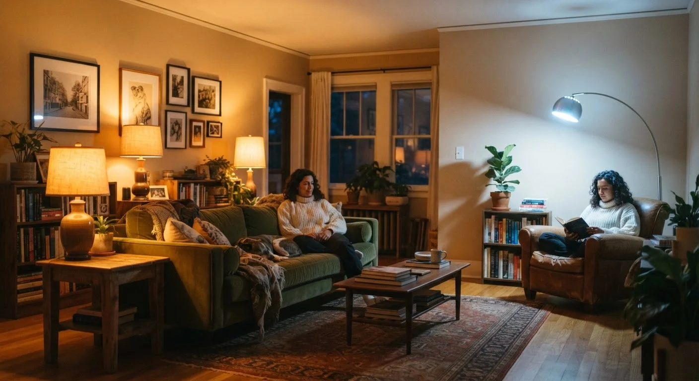
Photo credit: readerspanel.com
In this article
Warm versus cool bulbs affect mood, perceived room size, and how paint colors read. Here is what the Kelvin scale means for everyday decorating.
Key Takeaways
- Bulbs labeled 2700K to 3000K produce warm, amber light suited to relaxing spaces like bedrooms and living rooms.
- Bulbs in the 4000K to 5000K range produce neutral to cool white light, well matched to kitchens, bathrooms, and workspaces.
- Color temperature affects how paint colors read: warm light pulls wall colors toward yellow and orange; cool light reveals truer blues and grays.
- Mixing very different color temperatures in the same room creates visual discord that can make a space feel unsettled.
- Dimmable bulbs reduce intensity but do not change color temperature unless the bulb is specifically designed to shift color when dimmed.
What the Kelvin scale actually tells you
Every light bulb sold in the United States carries a Kelvin rating, usually printed on the box alongside wattage and lumens. That number tells you nothing about brightness. It tells you about color, specifically the hue of light the bulb casts across every surface in the room.
The practical range for household bulbs sits between roughly 2700K and 6500K. At the low end, light looks amber and soft, close to the glow of a traditional incandescent bulb or a candle. At the high end, light looks crisp and blue-white, close to noon daylight on a clear day. Most rooms call for something in between, and the right choice depends on what the room is used for.
Lumens measure how much light a bulb produces. Kelvin measures what color that light is. Both matter, but they solve different problems. A bright bulb at 2700K is still a warm bulb; a dim bulb at 5000K is still a cool one.
How color temperature changes the feel of a room
Warm light (2700K to 3000K) tends to make spaces feel smaller and more enclosed, which works in favor of a cozy bedroom or a dining room where intimacy is the goal. It softens shadows, reduces contrast, and gives skin tones a flattering quality. For bedrooms, warm light also avoids the alerting effect of blue-spectrum light, which is relevant if you use table lamps or overhead fixtures in the hour before sleep. The environmental factors that support restful sleep include light quality alongside color and clutter.
Cool light (4000K to 5000K) increases contrast and makes detail easier to see. Kitchens benefit because food colors read more accurately under cooler light and task work around countertops and cutting boards is easier. Bathrooms used for grooming benefit for the same reason: color-accurate light around a vanity mirror reduces the chance of mismatched makeup or missed shaving spots.
Neutral white (3500K) falls between the two and suits spaces that serve double duty, like a home office that is also a guest room, or a kitchen open to a living area where you want the lighting to feel consistent across zones.
Check the label, not the bulb color
The glass of an LED bulb often looks the same regardless of its Kelvin rating. The color temperature is printed on the box, usually near the lumen count. Look for a number followed by 'K' or a descriptor like 'soft white,' 'bright white,' or 'daylight' to identify what you are buying before you install it.
Color temperature and paint: what changes on your walls
Paint colors do not look the same under every light source, and this is one of the most common sources of frustration when homeowners choose colors from small chips viewed under store fluorescents. Warm bulbs add yellow and orange to every surface. A cool gray wall at 2700K can read almost beige. A crisp white at 5000K can feel clinical.
The problem is pronounced with whites and near-neutrals. If you have chosen a paint described as 'cool white' or a gray with blue undertones, a warm bulb will fight against those undertones and the wall may look muddier than intended. This is part of why white walls are less straightforward than they appear: the white you chose in the showroom may read completely differently once it is on your walls under your specific fixtures.
The practical fix is to test paint samples on the actual wall, in a patch large enough to read clearly, and view them at different times of day under the bulbs you plan to install. A sample viewed only by daylight through a window gives you incomplete information if the room is primarily used at night with artificial light.
Layering light sources without creating conflict
Most rooms have more than one light source: an overhead fixture, table lamps, under-cabinet strips, perhaps a floor lamp. Keeping all of them within roughly 500K of each other prevents the visual conflict that comes from one warm corner and one cool corner in the same space.
Accent lighting (used to draw attention to art, architectural features, or shelving) can sit at a slightly different temperature from ambient light without causing problems, because the eye reads it as intentional contrast rather than inconsistency. The issue arises when general-purpose fixtures in the same zone carry very different Kelvin values.
Recessed ceiling fixtures are often installed with whatever bulbs the electrician had on hand, which may not match the lamps already in the room. Replacing them to match your existing light sources is a straightforward change that can bring a room into better visual coherence without any other adjustment.
This article is for general home decor information only. Electrical work involving wiring, fixtures, or panels should be carried out by a licensed electrician. Always verify local permit requirements before undertaking any electrical project.
Frequently Asked Questions

Author
Home & Garden Editorial Team
Home & Garden Editorial Team is the collective byline for our editorial team and contributor network. Articles published under this byline or an editorial pen name are researched, written, and reviewed according to our editorial standards for clarity, consistency, and independence before publication.
View all articles →