
Gallery Walls Done Right: Layout, Spacing, and Framing Decisions That Actually Hold Up
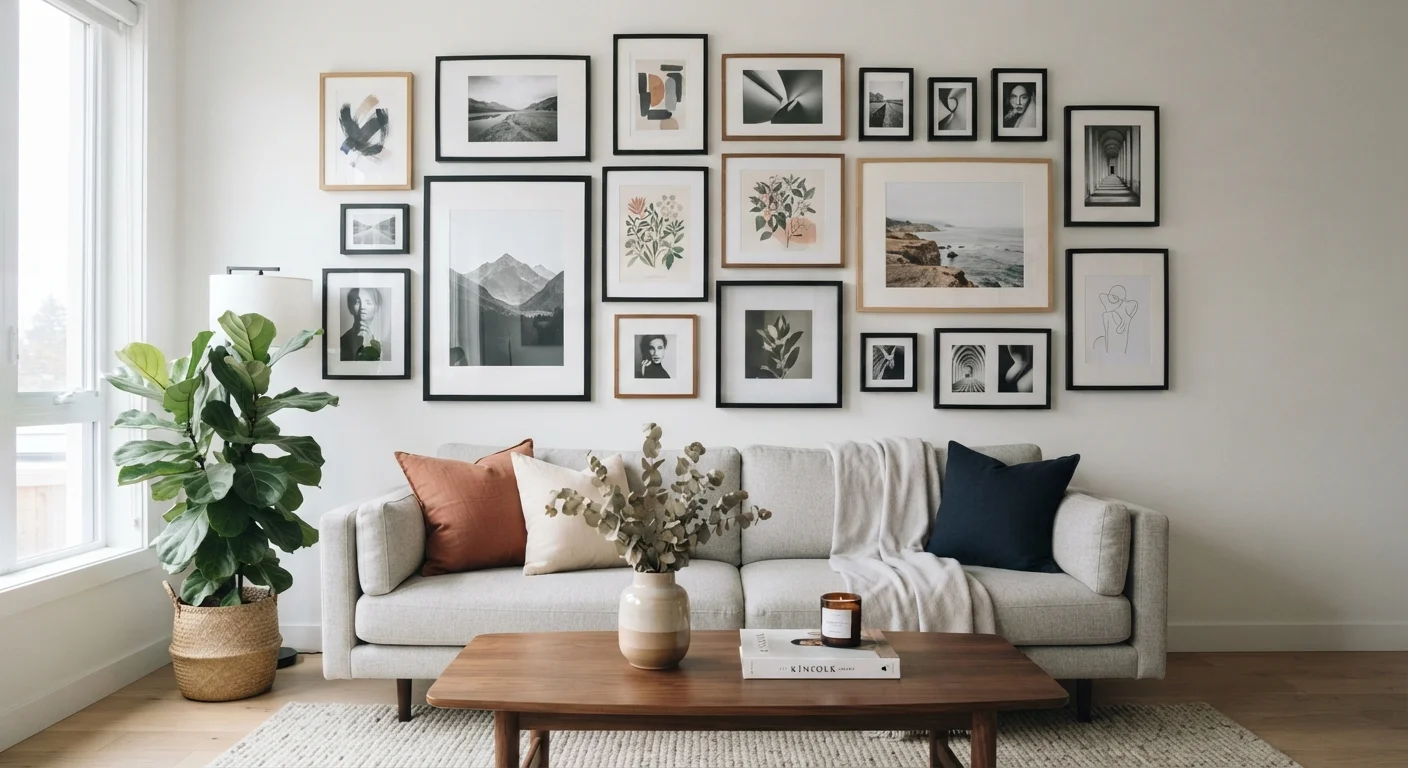
Photo credit: readerspanel.com
In this article
A gallery wall is one of the most personal decor moves you can make. Learn how to plan the layout, choose frame finishes, and hang it without regret.
Key Takeaways
- Plan your layout on the floor or paper before making any holes in the wall.
- Consistent spacing between frames (2 to 3 inches) gives a gallery wall visual order.
- A mix of frame finishes can work, but limit yourself to two metals or two wood tones.
- Anchor the arrangement to a nearby piece of furniture to keep it from floating awkwardly.
- Heavier frames belong on studs or wall anchors rated for the load.
Start with the wall, not the frames
Before buying a single frame, measure the wall and identify what it sits near. A gallery wall hung above a sofa reads differently from one on a narrow hallway wall or a staircase. The surrounding furniture sets the visual boundary, and your arrangement should respond to it.
A common mistake is filling the wall edge to edge. Instead, treat the furniture below as the bottom anchor. The gallery should extend roughly the width of that piece, give or take a few inches on each side. On a blank wall with no furniture anchor, the arrangement will look arbitrary unless you give it a clear center point or a strong horizontal baseline.
If you are working in a smaller space, room scale affects how a gallery reads: a tightly packed grid of small frames on a large wall will look sparse, while an oversized arrangement in a tight room will feel crowded.
Layout options and how to choose between them
There are two broad approaches: a grid (uniform frames in even rows and columns) and a salon-style arrangement (mixed sizes in an organic cluster). Each has trade-offs.
A grid is predictable and forgiving because the math is straightforward. If all your frames are the same size, a grid almost always works. It suits more formal rooms and hallways where clean lines match the architecture.
A salon-style arrangement allows mixed sizes and shapes, but it requires more planning. The standard method is to trace each frame on kraft paper or newspaper, cut out the shapes, and tape them to the wall with painter's tape. Move them around until the negative space feels even and no single frame looks stranded. The goal is roughly equal gaps throughout, not symmetry.
Whatever layout you choose, map it on the floor first. Lay frames out on a rug or hardwood and photograph the arrangement from above. That photograph is your reference when you move to the wall.
Map the full arrangement on the floor before marking the wall
Decisions made on the floor are reversible; decisions made on the wall create holes. Working flat lets you see the actual spacing and proportions without committing to anything.
Use paper templates for mixed-size layouts
When frames are different sizes, eyeballing placement on the wall leads to uneven gaps and misaligned centers. Paper templates let you adjust without any damage.
Anchor the arrangement visually to nearby furniture
A gallery wall that floats in the middle of a blank wall with no relationship to furniture below it looks unmoored. Furniture gives the arrangement a logical base.
Limit frame finishes to two per arrangement
More than two finishes fragment the composition. Choosing one dominant and one accent finish gives the wall variety without visual competition between the frames themselves.
Check wall anchor weight ratings before hanging
Drywall anchors have specific load limits, and a heavy frame on an undersized anchor can fail. Matching the anchor to the actual weight of the frame prevents damage to the wall and the piece.
Spacing and hanging mechanics
Two to three inches between frames is a reliable standard for most gallery walls. Less than two inches can look cramped unless you are intentionally going for a dense, editorial feel. More than four inches and the pieces start to feel unrelated.
Mark every hanging point in pencil before committing. A laser level or a long spirit level keeps horizontal rows true. For heavier frames (anything over a few pounds), locate wall studs with a stud finder and use appropriate anchors for drywall when studs are not where you need them. Check the weight rating on any anchor against the actual frame weight.
The top of most gallery arrangements hangs best when the visual center of the cluster sits at roughly eye level, which for most rooms is around 57 to 60 inches from the floor. This is a guideline, not a rule: a low-ceilinged room or a seating area may call for a lower center point. Nail holes are minor, but planning ahead saves unnecessary patching.
Framing decisions that hold together over time
Frame finish is where many gallery walls become visually noisy. Mixing every finish in the room produces a collection that looks accidental rather than considered. A workable approach is to pick one dominant finish and allow one secondary finish as an accent. Black frames with a few natural wood frames, for example, or all white frames with one or two thin brass pieces.
Mat width matters as much as frame color. A wide mat (2.5 inches or more) around a small print makes the print feel more substantial and gives the overall wall more breathing room. Narrow mats suit larger prints that can carry their own visual weight. Mismatched mat widths across a single arrangement draw the eye to the inconsistency rather than to the art.
Consider what you are framing alongside how the frames look. Photographs, prints, pressed botanicals, and small textile pieces can all coexist if the framing treatment ties them together. A gallery wall on a painted accent wall benefits from frames that contrast the wall color rather than blend into it. On white or off-white walls, almost any frame palette reads clearly.
Finally, plan for change. A gallery wall that uses standard frame sizes is easier to update than one built around a few oddly-sized custom pieces. Keeping a couple of blank spaces in the arrangement from the start gives you room to add something new without tearing everything down.

Author
Home & Garden Editorial Team
Home & Garden Editorial Team is the collective byline for our editorial team and contributor network. Articles published under this byline or an editorial pen name are researched, written, and reviewed according to our editorial standards for clarity, consistency, and independence before publication.
View all articles →