
Mixing Wood Tones at Home: When It Reads as Eclectic and When It Reads as Accidental
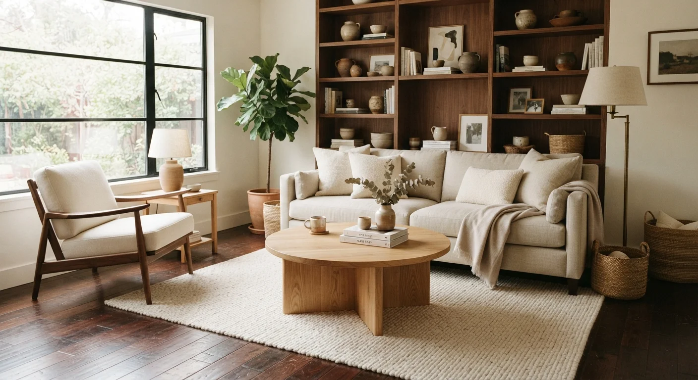
Photo credit: readerspanel.com
In this article
Multiple wood tones in one room can look rich and layered or just mismatched. Learn the principles that separate intentional mixing from clutter.
Key Takeaways
- Vary wood tones by at least two shades to signal that mixing was intentional, not accidental.
- Anchor the room with one dominant wood tone, then layer one or two secondary tones around it.
- Warm and cool wood tones can clash; keeping all tones in the same temperature family creates cohesion.
- Contrast in grain pattern and texture helps the eye read different pieces as a deliberate composition.
- Repeating each wood tone in at least two places in the room ties the mix together visually.
Why wood tones read differently than other materials
Paint colors can be easily swapped and textiles changed on a weekend, but wood is harder to reverse. A floor, a built-in cabinet, or a dining table all carry their wood tone for years. Because wood is both structural and decorative, mismatches between pieces feel more permanent and harder to explain than a pillow that clashes with a rug. Before choosing new furniture or refinishing a surface, it helps to understand what makes mixed wood tones look considered versus thrown together.
The difference almost always comes down to contrast and repetition. When two wood tones are too close in color, the room reads as if someone tried to match everything and failed slightly. When they are clearly different, the room reads as a choice. That shift in perception is the foundation of intentional mixing. See how to evaluate high-commitment decor choices before committing to a new wood finish.
The principles that make mixing work
Anchor the room with one dominant wood tone before introducing others
Without a dominant tone, the eye has no reference point and treats every piece as equal, which makes the room feel busy. One tone covering the largest surface area, usually the floor or a major furniture piece, gives the rest of the composition a place to depart from.
Keep all wood tones in the same color temperature
Wood finishes lean warm (orange, yellow, red) or cool (gray, green, ashy). Mixing a warm honey pine with a cool gray-washed oak creates tension that is difficult to resolve with other decor choices. Staying within one temperature family lets tones vary in depth without fighting each other.
Separate tones by at least two visible shades
When two wood tones are nearly identical, the room looks like an imperfect attempt at matching rather than a deliberate design decision. A clear tonal gap signals that the difference was chosen, not accidental.
Repeat each wood tone in at least two locations in the room
A single piece in an isolated tone looks like it wandered in from a different room. Repeating a tone, even in a small object like a lamp base or picture frame, ties it into the composition and makes it feel deliberate.
Use grain texture and finish sheen as secondary variables to add depth
Color is the most obvious variable in wood, but grain pattern and surface finish also affect how the eye reads different pieces together. Deliberately varying these qualities adds richness without adding more tones.
Quick steps you can take today
Before moving any furniture or buying anything new, a simple audit of your existing wood tones tells you where the room stands.
For rooms where the floor is a fixed variable, layering rugs is one of the most practical tools: a rug visually separates furniture groupings from the floor, reducing the pressure for every wood piece to relate directly to the planks beneath it. Similarly, an accent wall in a warm or muted tone can pull disparate wood shades into a shared context without any refinishing.
If a room has shelving or bookcases with mixed wood accessories, shelf styling principles apply the same logic: grouping by color temperature and leaving intentional negative space reads as curation rather than accumulation.
When to stop adding tones
Three distinct wood tones in one room is usually the workable ceiling. Beyond three, the composition asks the eye to reconcile too many variables at once, and the result tends to feel restless rather than layered. If a room already has a light pine floor, medium oak cabinetry, and a dark walnut dining table, a fourth tone in a side table or picture frame will almost certainly dilute the composition rather than add to it.
Painted furniture is an exit ramp when the wood count gets too high. A piece finished in a solid, muted color stops competing with the wood palette and lets the tones already present breathe. Wall color myths are worth revisiting here too: a wall that reads as truly neutral (neither warm nor cool) gives mixed wood tones the best backdrop to coexist without fighting each other or the architecture.
Wood grain texture also matters independently of color. A smooth, tight-grained maple and a heavily figured, open-grained oak can look mismatched even when their colors are close, because the surfaces have different visual weights. Pairing pieces where grain character is roughly similar, or deliberately contrasting a smooth piece against a heavily textured one, avoids the middle-ground confusion of two pieces that look like they are almost the same but not quite.

Author
Home & Garden Editorial Team
Home & Garden Editorial Team is the collective byline for our editorial team and contributor network. Articles published under this byline or an editorial pen name are researched, written, and reviewed according to our editorial standards for clarity, consistency, and independence before publication.
View all articles →